Every once in a while, an artist gets the itch to refresh something small, simple, and often overlooked—like a business card. Honestly, mine needed a glow-up. Over the past year, my creative direction has shifted toward enabling others to make art, supporting folks at different ability levels, and leaning more into handmade products. My card didn’t reflect that anymore. It felt… shy. And I’m not really in a shy season of life.
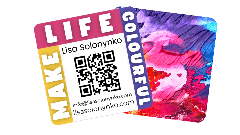
So, I redesigned it. And because I fully believe life should be colourful, the new version is exactly that—bright, square, joyful, and unmistakably artistic. There’s something fun about a square card—it stands out in a world full of rectangles. It feels a bit rebellious in the friendliest way.
This redesign also gave me a chance to honour my new focus. I added a playful, approachable layout that hints at what I love most: helping people feel confident with art materials, celebrating creativity at all levels, and building community through making. I wanted people to understand, immediately, that I’m not just an artist selling things—I’m an artist inviting you in. And the card now carries that energy.
It also pairs beautifully with my new product line, workshops, and the volunteer work I do at Silver Spring Studio. Whether someone picks it up at a craft show, from one of my kits, or after a class, I want them to feel like they’ve just been handed a tiny burst of encouragement. A small reminder that creativity doesn’t need to be perfect—it just needs to be fun.
And honestly? A business card should be a conversation starter. Mine is now exactly that. Bright, bold, handmade, and unmistakably “me.”
If you ever redesign yours, here’s my biggest tip:
Include your joy in it. People can feel that.